
I'm an Industrial Designer in Chicago, a graduate from UIUC,
and open to work. Scroll down to have a look at a few of my
projects and how the website was redesigned!


Website Redesign
Brief :
Build a portfolio website that shows off the unique design thinking in clear and articulate stories. That shows progression, playfulness and professionalism. As well as growth shown from feed back that is open to further progression.


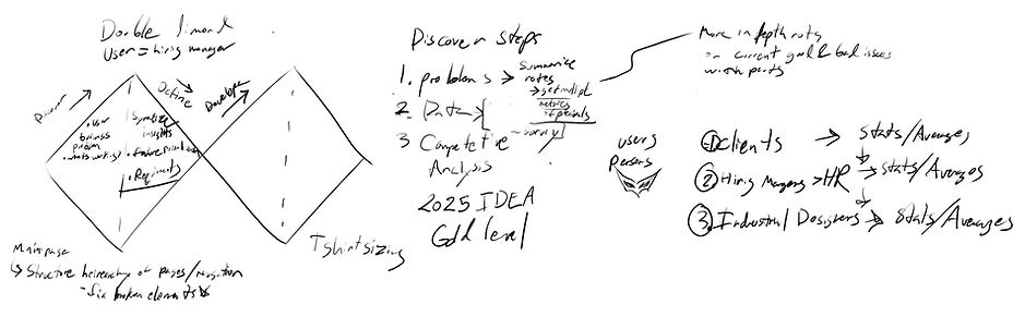
Redesign Comments - Per a Web Dev
I had a Web Dev I know go over a few issues with the original site that I could improve upon. The main take aways from their critiques being that it had a lot of accessibility issues. As well that the front page needing to show all my basic qualifications up front. As most in industry don't spend much time on exploring applicants websites. Essentially needing to have a hook to and to show everything that the should be needed to know for hiring basically up front.
Goals
-
Create a site that meets ADA standards
-
A Home page that shows basic skills and qualifying information
-
Displays novel thinking in an age of AI
-
Show off design thinking and research
-
Have visual representations of novel outcomes
-
Ease of navigation and intuitive use
Inspiration


.jpg)
Personas
Jeff Hiring Manager
-
Looking for a candidate that is easy to work with good communicator
-
Looking for someone who meets and knows design standards
-
Looking for someone who know how to use AI and emerging tools
Susan UX Designer
-
Looking for someone who know basics UI UX tools
-
Looking for someone is a team player and easy to work with
-
Looking for someone who knows accessibility standards
-
Looking for someone to understand brand, and marketing landscapes
John UIUX Manager
-
Looking for someone with clear communication able to work with UI and UX and marketing sides effectively
-
Someone able to research and bring insights and innovation to a project and team


Site Map
Homepage
PROJECTS
Lotus Chair
About
Side Quests
Resume PDF
Mountain Dish
Watering Can
Ginkgo Chair
Website 5 Day User Study from 1st Redesign
I was able to do a base face lift and reorganization of the site. I submitted a link on an online industrial design forum for further feed back on the redesign. Unfortunately I didn't get any comments but was able to get some good data based on where the link was seen and more importantly which pages and order in which they were visited. A lot of this partially confirms that the need to focus on Mobile as well gives a general look at audience where behaviors may be from.
The post was in English so it makes sense that the majority of clicks were from English speaking countries. This also does show that emphasis needs to be put readability in images alone as it could be extremely helpful to opportunities where English is not the primary language.
Country | Page views | Site sessions | Unique visitors |
|---|---|---|---|
United States | 85 | 40 | 40 |
Canada | 13 | 7 | 7 |
United Kingdom | 7 | 6 | 6 |
Germany | 9 | 4 | 4 |
India | 6 | 4 | 4 |
Australia | 7 | 4 | 4 |
Netherlands | 6 | 3 | 3 |
Austria | 16 | 2 | 2 |
Chile | 5 | 1 | 1 |
Taiwan | 1 | 1 | 1 |
Mexico | 4 | 1 | 1 |
Spain | 2 | 1 | 1 |
Denmark | 5 | 1 | 1 |
Singapore | 1 | 1 | 1 |
Indonesia | 1 | 1 | 1 |
Brazil | 1 | 1 | 1 |
Serbia | 1 | 1 | 1 |
Sweden | 1 | 1 | 1 |
Ghana | 1 | 1 | 1 |
Hong Kong | 1 | 1 | 1 |
Argentina | 1 | 1 | 1 |

This portion more or less confirms what I had been told per the Web Dev that Mobile by far needs to be designed first and desktop seconadry. As it is the main mode that most people accessed my portfolio.
While going over this as well I was given a further note by the dev, to double check that my website is loading correctly on the most popular browser as there was an issue on Firefox mobile.
Device type | Page views | Site sessions | Unique visitors |
|---|---|---|---|
Mobile | 114 | 62 | 62 |
Desktop | 59 | 20 | 20 |
Tablet | 1 | 1 | 1 |
Page path | Site sessions | Page views | Unique visitors |
|---|---|---|---|
/Homepage | 82 | 102 | 82 |
/Mountain-Dish | 15 | 15 | 15 |
/About | 14 | 17 | 14 |
/Lotus Chair | 12 | 12 | 12 |
/Tulip Watering Can | 10 | 13 | 10 |
/Ginkgo Chair | 9 | 9 | 9 |
/Side Quests | 6 | 6 | 6 |
I was able to look to the main pages that were visited overall. Primarily the Main page, Mountain dish were the project pages that got the most views. The Lotus Chair page (project 1), and the Watering Can (project 8) had the next those had less retention compaired to the top 2 pages however.
The main projects and pages that people were going to were the Mountain Dish, about, and Project 1 (which is the Lotus Chair page). I am able to see the majority of users did drop off after initially clicking onto the main page but a around half did stick and click around.


Take Aways
The Home Page needed the most work, as slightly more than half dropped off after clicking onto the site. Then the Watering can, and Lotus chair. The Mountain Dish and About page could get some improved organization but are the 2 best preforming pages as is for generating further interest in my work.
Case Study: Home Page
The original home page was fairly short and had a few outdated projects that didn't fit properly and were redundant as they did not show off multiple skill sets for myself.
The images were eye catching but they didn't really draw the eye in nor encourage people to click around. The text was hard to read for the corners and overall didn't convey the different skills I was attempting to show off. No CAD renders, nothing that would spark curiousity for most. The mountain dish project after the about had the most clicks for the study.

Visits | Button clicks | Avg. time on page | Exit rate |
|---|---|---|---|
82 | 0 | 14s | 63% |
With the redesign. I really wanted to emphasize everything the personas Jeff, Susan, and John would want to see based off of their needs in a portfolio website:
Jeff HR:
-
The main page color green is considered calm and friendly to show I am a calm, level headed team player.
-
A welcome message showing my basic credentials and an friendly invitation to explore the site further.
-
I changed the first image to a render as there were none on the homepage to show I have developed skills in CAD and Solidworks.
Susan UX:
-
Can see the invitation to scroll to see how this website was redesigned right away
-
Utilizing green for consistency and interactive feedback as well as clicking onto the about pages shows that I was part of the Sofa show team, and worked with a webdev as well as friendly message upon entering
-
Looking around the website can see that the site meets standardizations for ADA as well as general mobile vs desktop standards
-
Is able to see the variety of projects a well as the consistent branding of myself in this site and that continues into my resume and Linkedin
John UIUX Manager:
-
Clear messaging, as well as hints of something below to encourage the viewer to scroll, further inviting folks to explore, also using the message about the redesign to entice folks with some amount of mystery and ambiguity
-
Can see the research that has gone into the main page proportions and steps to optimize the home page that they have of just my portfolio website showing forethought onto being
-
Can recognize that the updated pictures on the homepage give much more of an invitation of curiosity ie: emphasizing the 3 legged nature of the Lotus Chair, more Mystery of the Mountain Raised Feeder with a render, and to a cast aluminum goose head to be memorable and have people explore the Side Quests page


Is the site finished?


For now. Future tweaks coming!
Come back and see improvements yet to come!